Orders were being picked using Slack
This was at a builders' merchant in London, where I was the only designer. Click & Collect started at one branch in 2024 and took off. Behind the scenes it ran on Slack and a spreadsheet. It worked, but only just.
By late 2025 we were doing about 30 collections a day at one branch, and more stores were coming. Copying the Slack setup to every branch would have been a mess, so we decided to build an app. I worked with one developer for about three months.
We agreed early on what good would look like: every picker choosing to use it, fewer picking mistakes, and customers waiting less. That's what I kept checking the designs against.
Why Slack wasn't working
Slack was being used as a to-do list, a record of who was doing what, the order details and the customer messages, all at once.
- Pickers scrolled a chat to find their next order. The bin (where an item is kept), weight and quantity were hidden in a PDF, and two people could start the same order.
- Customers were left waiting at the desk if someone missed their arrival message.
- Managers couldn't see what was going on or report on it.
What I saw watching the pickers
I did 5 observation sessions and 10 interviews with pickers, managers and the tech team. Most of my time went on the pickers.
They were carrying stock in one hand and scrolling Slack on their phone with the other, shouting across the yard to check who'd picked what.
The picklist (the list of items to collect) showed one item's weight, not the total, so pickers ended up walking back for a trolley.
One long chat, across two channels, for just one branch.
Issues disappeared up the chat, so nobody noticed the same one happening again.
Most of the process was actually fine. Slack was the problem. That's why I didn't try to change how they worked, just give it a proper home.
Starting with what goes wrong
A normal pick was the easy bit. The hard part is everything that goes wrong: missing stock, refunds, part collections and no-shows. If those weren't covered, people would just go back to Slack. So I mapped those flows first, before designing any screens, and walked pickers, the developer and managers through simple wireframes.
That walkthrough added ideas I wouldn't have thought of, like splitting big orders between pickers and flagging picks that were running late.
What I kept, and what I added
I kept the steps people already knew, because the team was busy and the app was optional. If it felt like learning a new job, they wouldn't use it. Then I added:
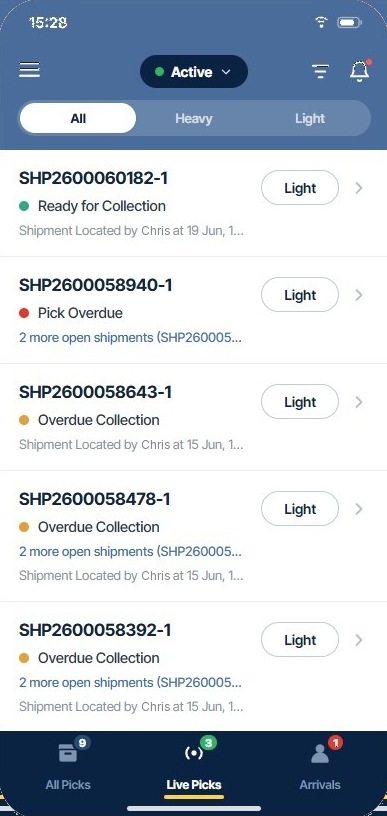
- Tabs for Live picks, Arrivals and All picks, with live counts so you can see what needs doing
- A picker status (online, break, offline) so managers could see who was free
- Notifications and comments, so pickers know when to act
- A store setting, ready for other branches
One button for the whole order
I didn't make pickers tick off every line. They're carrying stock with one hand, so tapping each item would have been too much effort. Instead there's one "Mark as picked" button for the whole order, and a flag on each line if something's wrong, like not enough stock or a damaged item. That kept the normal pick fast and still caught the problems.
Keeping the first version small
We launched with Click & Collect picking only. Deliveries could wait until we knew it worked. That kept the first version small enough to build in three months with one developer.
The final app
Try a working version
The real app launched in 2026 and is used by the pickers. This is a simplified version with made-up orders, so you can try it yourself:
- Open the first order and tap Start picking.
- Flag a line if something's wrong.
- Tap Mark as picked once for the whole order.
- Wait for the customer to arrive, then bring it out.
It's built with HTML, CSS and JavaScript, matching the real app's design.
What testing with pickers changed
The picklist was the screen everything depended on, so instead of showing one design I used Claude, an AI tool, to quickly build a few working versions that pickers could actually use on the job. Watching them use it told me far more than showing them static screens.
Order of information
- Tried
- Product code, bin, then quantity.
- Learned
- What you need first depends on whether you're finding an item or counting it. I'd got that wrong.
- Changed
- Took the best parts of each version and changed the order.
Row size
- Tried
- Big cards for each item.
- Learned
- Orders with lots of items took too long to scroll.
- Changed
- Smaller rows, so more of the order fits on screen.
Claude was great for getting working versions in front of people fast, but it didn't know how the yard worked. That came from the pickers.
Results
100%
Of pickers using it
By the end of month one, even though it was optional
from 7.6%0.4%
Orders needing fixing after picking
In the first month after launch. Before, about 1 in 13 needed fixing
from 239.5
Customer arrivals missed by staff, per 100 orders
Reminders when nobody picked up a customer arrival
Live
Status for every order, in every store
Picker names on each order, and the reporting managers had asked for
★★★★★
“Loved the click and collect service and the bonus that staff bring your goods to the vehicle. Top marks!!”
What I'd do next time
I'd measure how long customers actually wait, not just missed arrivals. Missed arrivals showed us when things went wrong, but not how long people were waiting on a normal day.
Time was also tight, so I moved quicker on smaller features like comments. With more time I'd give those the same attention.
Want to hear more?
There's more I can share about this project, like how we tested working versions with pickers on the job. I'm happy to talk it through.